Data Science Web Apps with Streamlit
Introduction
This repository contains three interactive web applications built using Streamlit. Each application focuses on different data science problems:- stock market visualization.
- iris species prediction.
- widget data analysis.
- Machine learning Interactive Dashboard with Python – Streamlit
Note:
- Few example projects are in my github repository.
- You can find my streamlit profile at:

Machine learning Interactive Dashboard with Python – Streamlit
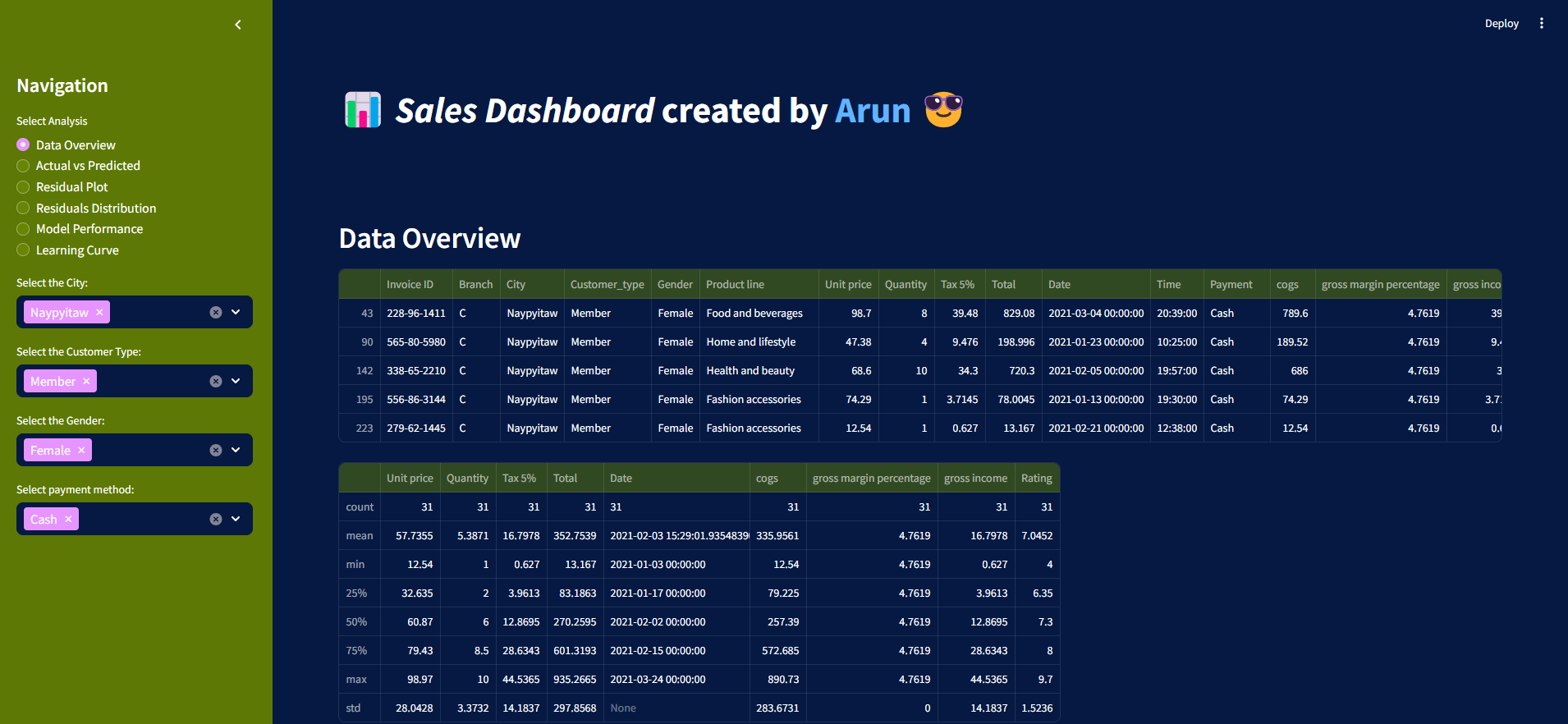
Sales Dashboard built-in Python and the Streamlit library to visualize Excel data.The dashboard is available at streamlit: https://supermarket-salesdashboard.streamlit.app/
A glimpse of the project can be seen as:

Summary of the projects: The objective of the machine learning component in the Supermarket Sales Dashboard is to predict total sales based on key features, such as product quantity, unit price, and gross income. By leveraging linear regression, the model aims to uncover relationships between these variables and the total sales generated. The process involves:
- Data Preprocessing:
- The dataset is cleaned and encoded using pd.get_dummies() to handle categorical variables like 'Branch', 'City', 'Customer_type', 'Gender', 'Product line', and 'Payment'.
- The features selected for the model are Quantity, Unit price, and gross income, while the target variable is the Total sales.
- Train-Test Split: The dataset is split into training and testing sets using an 80-20 ratio (train_test_split() with test_size=0.3), ensuring that the model is trained on one portion and validated on the other to avoid overfitting.
- Model Training: A Linear Regression model from sklearn is trained on the training data. This model learns the relationship between the input features (X_train) and the target variable (y_train).
- Prediction and Evaluation:
- After training, the model predicts total sales on the test set (y_pred).
- The model's performance is evaluated using metrics like R-squared (r2_score()) and Mean Squared Error (MSE) (mean_squared_error()), which are essential indicators of how well the model fits the data and its accuracy.
- Visualization: Several plots are generated to provide insights into the model's performance, including:
- Actual vs Predicted Sales: Scatter plot to compare predicted values against actual sales values.
- Residual Plot: Visualizing the differences between predicted and actual values, showing how well the model fits.
- Distribution of Residuals: A histogram to analyze the distribution of prediction errors (residuals).
- Model Performance Metrics: Bar charts that highlight R-squared and MSE for easy comparison.
References
Some other interesting things to know:
- Visit my website on For Data, Big Data, Data-modeling, Datawarehouse, SQL, cloud-compute.
- Visit my website on Data engineering

